
Skip to main content
View →
View →
View →
View →
Visit →

Jackson State University
JSU BRAND STYLE GUIDE
Sans Serif Typography
Franklin Gothic is an ideal choice for sans serif font because of its availability and the fact that it has a number of weights.
Typography
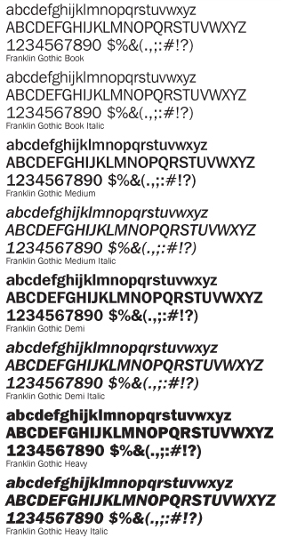
JSU Brand Style Guide, page 18 — Franklin Gothic specimens
The Franklin Gothic Font Family
Franklin Gothic is an ideal choice for sans serif font because of its availability and the fact that it has a number of weights. Although serif fonts are preferred for items with heavy copy, Franklin Gothic book works well in documents with less copy that don’t have multiple columns of type. The demi and heavy version of Franklin Gothic are ideal when a bold headline is needed.
- Font Family
- Franklin Gothic
- Chosen For
- Availability and its number of weights
- Franklin Gothic Book
- Documents with less copy and no multiple columns of type
- Demi and Heavy
- Ideal when a bold headline is needed
- Heavy Copy
- Serif fonts are preferred — see Serif Typography
- Guide
- JSU Brand Style Guide, page 18
Applying the family
Choosing a weight
Book
Franklin Gothic Book
Works well in documents with less copy that don’t have multiple columns of type.
Demi and Heavy
Bold headlines
The demi and heavy version of Franklin Gothic are ideal when a bold headline is needed.
Heavy copy
Use serif instead
Serif fonts are preferred for items with heavy copy.
See Serif Typography →
Related sections
Elsewhere in the style guide
Serif Typography
The serif typeface preferred for items with heavy copy.
Color Scheme
The official Jackson State University colour palette.
The JSU Signature
Correct use of the university signature.
General Stationery
Letterhead and stationery templates.
JSU Web Guide
Web identity standards for official JSU websites.
Producing something for JSU?
Check the typography, colour, and signature standards before you publish.
Get in Touch
JSU Brand Style Guide
Mailing Address
P.O. Box 17199
Jackson, MS 39217
Jackson, MS 39217
Phone
Fax
601.979.8246
Copyright
Copyright 2012, Jackson State University®